Saturday, April 6, 2024

HIMI Jelly Gouache Color Review #4: Jade Green, Grass Green, and Yellow Green


This is the fourth in a series of reviews of the individual colors from the HIMI brand 24-color “jelly” gouache paint set. This review will concentrate on the HIMI Jade Green, Grass Green, and Yellow Green jelly gouache paint colors and will also include updates on my Star Trek painting and how my swatch chart is coming along.

Setting aside the mint green grass debacle (see the review of HIMI Gouache color 005 – Pale Green for that https://allsortsartbyali.blogspot.com/2023/09/himi-jelly-gouache-color-review-3-pale.html) for a while, I turned back to working on the background of the painting. I needed a line of trees in the background, and so I was looking for a green that was darker but very cool, since cool colors recede.


HIMI Jelly Gouache color no 002 – Jade Green


There was a color in the collection called Jade Green - this is HIMI gouache color 002. It is a very dark color with a very cool cast, kind of like the green version of the Acid Blue that I discussed in a previous post (https://allsortsartbyali.blogspot.com/2023/07/himi-jelly-gouache-color-review-white.html). 

As with the other colors, it was very creamy in consistency once I had given it a good stir to get it well-blended. It was very dark, but gouache is easily lightened by diluting it with water or by mixing it with white or lighter colors. Since this was for the background and it's best to work thin-to-thick, I chose to simply dilute with water for the lighter bits. It made a good color for the background trees, so I went ahead and painted in the treeline and then added the Jade Green to my swatch charts.


HIMI Jelly Gouache color no 072 – Grass Green


Now that the trees were established in the background, I went back to working on the grass to complete the background of the picture. The obvious choice at this point was Grass Green, at which I had turned up my nose before. Not surprisingly, it ended up being an appropriate color for the grass, as you can see in this picture.


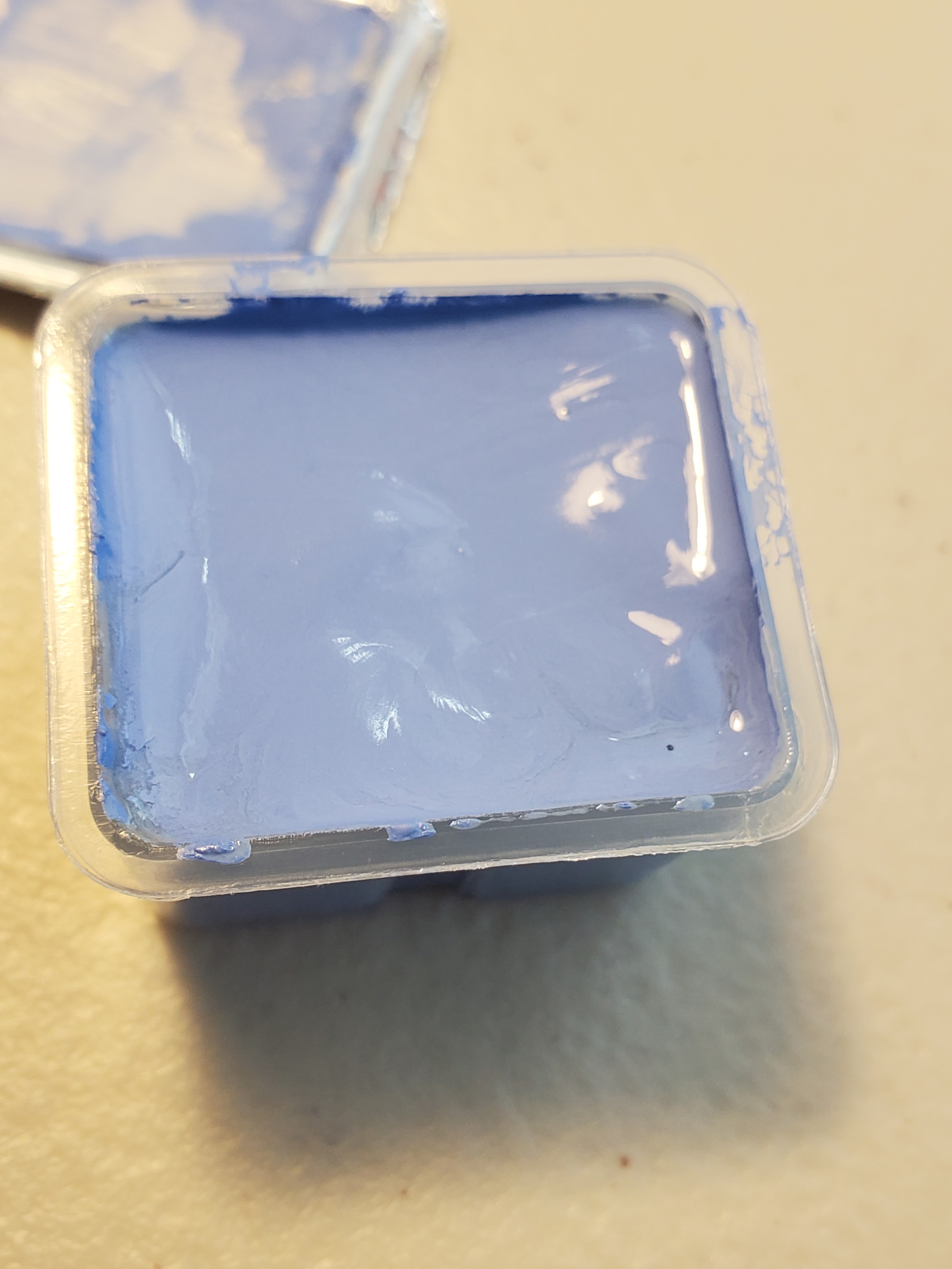
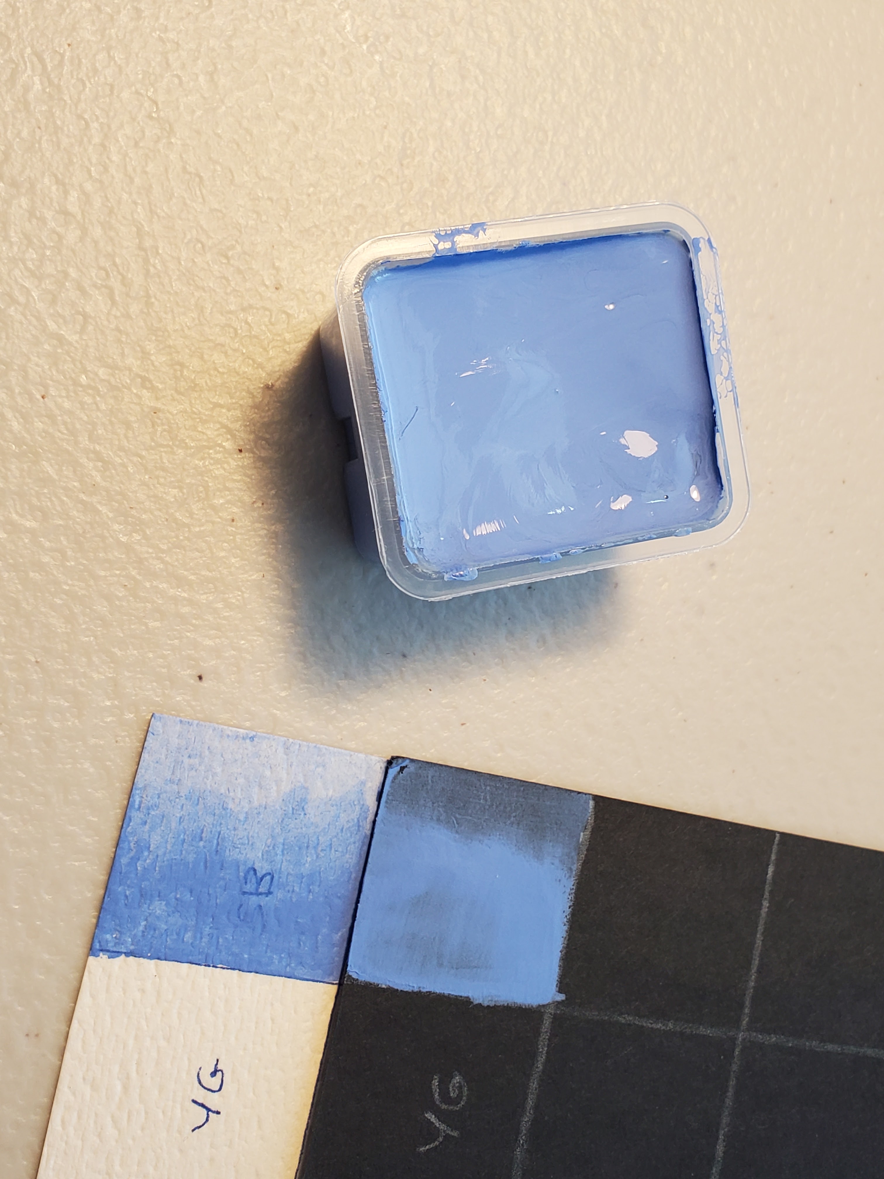
HIMI Jelly Gouache color no 018 – Yellow Green


I also added the color Yellow Green to highlight the areas where the sun would naturally be striking the grass, so that I could have a nice sunny meadow to compliment my bright blue sky. As you can see from the swatch chart at the top of the page, the Grass Green and the Yellow Green are extremely warm - that is, they have a lot of yellow in them - in contrast to the Jade Green and the Pale Green colors, which are extremely cool, meaning that they have a very blue undertone.

Now the background of the picture is pretty much complete, and I can move along to painting my characters!


For the original post describing the unboxing of the HIMI jelly gouache paint set, go here: https://allsortsartbyali.blogspot.com/2023/03/unboxing-himi-jelly-gouache-24-color-set.html


For the first review in the series, go here: https://allsortsartbyali.blogspot.com/2023/06/himi-jelly-gouache-color-review-1-sky.html


For regular shenanigans, please follow my Facebook page, https://www.facebook.com/allsortsofart


Saturday, January 6, 2024

What Are the Different Grades of Drawing Pencils, and What Do they Mean?


If you are new to drawing, you may be looking at art supplies and notice that drawing pencils often come in sets that include a range of leads. Usually, these are labeled with H and B along with various numbers. Some brands have other letters, just to make things confusing - for whatever reason, Staedtler uses E. Most lines, however, use the grades you see in the sample chart, above, which can also include F. Don't worry, I will explain what the different grades mean – even the rare ones. 


Basic Info about Drawing Pencil Grades

First things first: a pencil "lead" is a stick of compressed graphite powder, so no worries about being in contact with actual lead. As you draw, you leave a trail of that graphite powder on the surface of the paper. The various pencil grades indicate exactly how much of the powder you will leave, which determines the quality of the mark you make. 

Let's start with the letters: H stands for H and B stands for soft (yeah, I know – maybe it would help to think of the softness of a baby or a bunny). HB is in the middle, and then you go up the numbers to the hardest and softest leads. The hard leads make a lighter mark that is more precise (because less graphite is being deposited) and the softer leads leave a darker, less-defined line, because more of the soft graphite particles are being shed onto the paper surface. The higher the number, the more of this characteristic there is: an 8B is loads darker and smeary that a 2B, and as expected, an 8H is harder and more precise than a 2H (you may notice that there's no 1H or 1B – those are just H and B). 

As for the one-offs, F stands for either Firm or Fine (as we've learned, a firm lead makes a fine line, so they are essentially interchangeable). As you can see from the above chart, F is in the middle with HB, but is put on the H side. E, in the Staedtler lines, stands for Extra Black (they will sometimes use EE or EB, as well), so it would occupy the spaces after the highest B numbers. 

Fun fact: the "number 2" pencils commonly used in schools are a 2B lead. The reason they are so common is that they are required for the standardized tests we took as kids where you have to darken in an oval for the correct answer. The 2B lead is dark enough to be easily read by the optical scanner that grades the tests, but firm enough so that it doesn't smear into other circles.


The Best Drawing Paper to Use with Drawing Pencils

Anyway, let's talk about that paper surface I mentioned, which is the other part of the equation. If you've ever tried to draw with a pencil on a piece of slick posterboard, you'll have learned you can't get very artistic with it - the slick surface doesn't have enough tooth (texture) to abrade the graphite particles off of the pencil. It's fine - posterboard is designed for ink, which likes a smooth surface to sit on. For pencil drawings, however, you will want a paper surface with some tooth. How much depends on what hardness of pencil. 

If you are using very soft pencils, use a paper with more texture, like pastel/charcoal paper, which is designed to grab those particles and hold them in their nooks and crannies, allowing you to build up layers of tone. For harder pencils, use a smoother surface, so your pencil won't catch or "skip" on the texture.


Tips about Using Different Drawing Pencil Grades

Be aware that the harder the lead, the more it tends to press into the paper. If you are trying to make a fine art drawing, you will be sad, because these teeny little furrows will mess up your flow. If you are making a technical drawing, however, you will be fine, because you will probably be using a hard surface - perhaps vellum - on which to draw, and you will be ruling precise lines that probably won't need to be shaded over or erased. 

Soft leads have their own challenges. The softer the lead, the more it tends to smear – great for blending and building up dark tones; bad for maintaining the cleanliness of you, your clothing, the work surface, etc. Be warned. 

A word of warning about these pencil sets: You might be tempted to mix the different leads in the same drawing, since you have a bunch. Yeah, don't do that. The hard leads have a noticeably "silver" cast, down to a much darker, charcoal-like black for the softest leads. They DON'T look good together. Don't go more than two grades away (say 4/5/6B, for example) if you want your tone to be consistent. Anyway, your really don't need all these different grades, in my opinion: If you want a lighter line, don't press down as much. For a darker line, press harder, thus depositing more graphite. That's how I get the full tonal range with just one grade of pencil. I personally use a regular old #2 mechanical pencil (Papermate Sharpwriter, if you're curious), and I can get a decent tonal range out of it (see my drawing of Tom Cruise below).


Enjoy your journey into the wonderful world of drawing! Drawing is a wonderful baseline skill to develop that will in turn improve your skills as a painter, a printmaker, and a designer or illustrator. I hope my tutorial helped. 


For regular shenanigans, please follow my Facebook page, https://www.facebook.com/allsortsofart 


Other articles about drawing you might like: 

https://allsortsartbyali.blogspot.com/2016/02/learning-to-draw-first-step-have-right.html

http://allsortsartbyali.blogspot.com/2015/03/i-have-been-professional-portrait.html

http://allsortsartbyali.blogspot.com/2015/03/figure-drawing-101-wacky-secrets-of.html

http://allsortsartbyali.blogspot.com/2015/05/figure-drawing-101-so-you-wanna-be.html 


Image credits: pencil grading chart - https://upload.wikimedia.org/wikipedia/commons/f/fa/PencilGradingChart.png

portrait of Tom Cruise – my original art, see copyright notice 

Tuesday, October 17, 2023

Step-By-Step Tutorial: How to Draw the Houndstooth Pattern


A very classic and popular pattern for clothing, especially coats, jackets, and hats, is houndstooth. This pattern is usually seen in black and white, although any contrasting color scheme is possible. The name “houndstooth” is an attempt to describe the angular, intricate repeating pattern; it is called “pied de poule” (chicken foot) in French, but I like to think of it as “bunny in a bow tie” (more on that later).

Although the houndstooth pattern looks extremely intricate, it is formed of very basic geometric shapes – squares and stripes – and can be fun to doodle, once you get the hang of it. Many people find doodling relaxing and meditative, and some people find that doodling helps them concentrate. If you like to doodle or draw intricate or repetitive patterns, you may find learning to draw the houndstooth pattern to be very enjoyable. I have broken it down into very easy, illustrated steps so that you can easily learn to draw houndstooth right away!


1. Draw a light grid or use graph paper. Draw and fill in every other square in a row, skip a row, then repeat.


2. Draw diagonal lines that exactly bisect each orthoganally-adjacent square. So, everything to either side, and above or below, your black squares.


3. Draw smaller lines on each side, so that those squares are divided into four parts. The little squares that are left with no lines are your white squares (or whatever color the paper is). As you draw, you will see that they will follow the same type of pattern as the black squares – there will be a white block every other square, with a striped square on each of its four sides, on the alternating rows. This is what will create the houndstooth pattern.


PLEASE NOTE: you do NOT draw a border or outline around these striped squares. Part of the stripes will connect to your white areas, so you don't want to “cut through” them.


4. Here's the tricky part. These squares are going to be striped in alternating black and white. That's clear enough. But, when going across, the stripey squares between the solid black squares all "start" with black in the lower left corner, and the next row down - where the stripey ones alternate with the solid white squares, the pattern is reversed, and the lower left corner is white.


The easiest way for me to remember what goes where is to see this pattern as a "bunny in a bow tie". Both sides of his little bow tie need to be the same color.


5. Continue as desired


You may find it easier to draw the pattern larger, especially if you would like to keep the smaller stripes more uniform and precise. This could also be easier if you are just starting to learn how to draw the houndstooth pattern, or if it is difficult to see or to draw the pattern at a smaller size.

Beneath the smaller houndstooth pattern on the graph paper below is a reference for houndstooth using a 2x2 pattern (each block is 2 across and 2 down, for a total of four graph squares in each block of solid or stripe). I left it partially unfinished so you can see how it is easier to draw the smaller connecting lines of the stripe sections in the houndstooth pattern. 


I hope you have enjoyed this tutorial! Join me on my Facebook page for more shenanigans! 


Cover image: https://en.wikipedia.org/wiki/Houndstooth#/media/File:Houndstooth.jpg

Step-by-step images, my originals (see copyright notice)


Saturday, September 16, 2023

HIMI Jelly Gouache Color Review #3: Pale Green


This is the third in a series of reviews of the individual colors from the HIMI brand 24-color “jelly” gouache paint set. This review will concentrate on the Pale Green jelly gouache color and will also include updates on my Star Trek painting and how my swatch chart is coming along and how the gouache set is holding up.

In previous reviews, I described my swatch charts and how I would be reviewing the HIMI gouache colors as I opened each one up to use in a small painting with a mythology/Star Trek theme done on a birthday card for a friend. The painting is an outdoor scene, and I paint back-to-front, so the first order of business would be establishing the thing that is ultimately the most background-y thing in a landscape: the sky. After HIMI's Sky Blue color turned out not to be what seemed like a softball (here's that experience: https://allsortsartbyali.blogspot.com/2023/06/himi-jelly-gouache-color-review-1-sky.html), I was able to make a decent sky out of Acid Blue (who knew?) and, of course, white. Details here, if you haven't seen that one: https://allsortsartbyali.blogspot.com/2023/07/himi-jelly-gouache-color-review-white.html

Now, the search is on for an appropriate color for the grassy meadow. There is literally a color in the set called Grass Green, but I wasn't going to be fooled again. In my wisdom (or maybe just cynicism), I started with Pale Green, a much less intense color. What the heck, I figured – it's easy enough to paint over. The swatch chart is not gonna fill itself.


HIMI Jelly Gouache color number 005- Pale Green


So, Pale Green is EXACTLY AS ADVERTISED. It's pale green. It's actually pretty much – at least it appears on the brown kraft-paper card – a mint green. Lovely color; not very grassy. Anyway, I painted the whole meadow anyway, so that when I painted over it, the color would be consistent. This ain't my first rodeo, y'all.


I swatched out Pale Green on my black and white charts by itself and also mixed 50/50 with White, Sky Blue and Acid Blue. 


It makes a nice emerald color when mixed with the Acid Blue. The Sky Blue didn't affect it much other than cooling it a bit. The White, predictably, just made it very minty. The opacity of this color is very impressive, and the granularity is very low. It's a smooth color, just not very grassy. Oh, well! Live and learn.


Here are the first four colors as I have them arranged in my set (picture was taken before swatching).


The Acid Blue is still a bit creamy, but the Sky Blue and the White have dried out a bit. Never fear! These paints aren't like acrylics – they don't dry waterproof. All it takes to revive them is a bit of water. You can drip clean water off your paintbrush, or if you would like to revive several, or all, of them, a little spray bottle does the trick nicely. I got this one from the dollar store. It works well, and it's super cute!


Next up, we'll see if Grass Green wasn't lying to me like Sky Blue did. 


Here is the first article regarding the unboxing and the overall quality and appearance of the 24-color HIMI jelly gouache set:

https://allsortsartbyali.blogspot.com/2023/03/unboxing-himi-jelly-gouache-24-color-set.html

For regular shenanigans, please follow my Facebook page, https://www.facebook.com/allsortsofart


Saturday, July 22, 2023

HIMI Jelly Gouache Color Review: White, Acid Blue


In the prior review https://allsortsartbyali.blogspot.com/2023/06/himi-jelly-gouache-color-review-1-sky.html,  I described my swatch charts and how I would be reviewing the HIMI gouache colors as I opened each one up to use in a small painting with a mythology/Star Trek theme done on a birthday card for a friend. The painting is an outdoor scene, and I wanted to start with the sky, but alas, Sky Blue turned out to be a bit too purpley - more of a periwinkle color (see above pic). Knowing that Ultramarine and Cobalt would also likely be too warm, I turned my attention to the blue that was most like Cerulean, called Acid Blue. It was very dark in the jelly cup, so I knew I would need White, as well. 


HIMI Jelly Gouache color number 108- White 


I opened the White first and swatched it in beside Sky Blue on my charts. Of course, you can't tell much from the white charts, but it had pretty decent opacity on the black charts and no granularity to speak of. It appears to be a good neutral white, with no hint of cream or grey that might skew it warm or cool. I mixed equal parts of the White with the previously-opened Sky Blue to create my first mix at the appropriate intersection on my swatch charts. It created a nice pale lavender.  


HIMI Jelly Gouache color number 017- Acid Blue 


Acid Blue isn't a typical color name, but I would liken this to cerulean, or perhaps phthalo blue. As with the other colors, it stirred up to a smooth, pudding-type consistency (not like a jelly, as the name implies) and applied smoothly to the swatch charts. The Acid Blue had good opacity and minimal granularity when diluted. When mixed with the White, it made a good sky color (middle). It also made a nice turquoise when mixed with the Sky Blue (right). Yay! I was able to start on the card. 


I laid in the sky and then used the White to indicate some clouds. With gouache, as with other paints, it's best to work lean-to-fat, so I started with a thinner wash, which I built up where I needed to. As you can see, the brown of the kraft paper shows through somewhat in some areas of the wash. I built up the wash to be more opaque in most areas, but I did leave some of this slight brownish tint showing, as I liked the aging effect. This was a conscious design decision by me and shouldn't be taken as an evaluation of the paint's coverage. 


The thing about gouache is that it's flexible - like traditional transparent watercolors, you can use varying degrees of dilution to control intensity, but unlike transparent watercolors, you can control the opacity, as well. Being able to go back in and rework the paint is very handy as, as well. I was able to go back in with just a wet brush to smooth out a couple of spots, and once the gouache dried, I was able to evaluate the respective values and add volume to the clouds with a heavier application of the White to add thicker-looking, highlighted areas. 

In the next post, I'll start the hunt for the right grass color! 

Here is the first article regarding the unboxing and the overall quality and appearance of the 24-color HIMI jelly gouache set:

https://allsortsartbyali.blogspot.com/2023/03/unboxing-himi-jelly-gouache-24-color-set.html


For regular shenanigans, please follow my Facebook page, https://www.facebook.com/allsortsofart 


Friday, June 30, 2023

HIMI Jelly Gouache Color Review #1 – Sky Blue, Swatch Chart, and Star Trek Painting Project


Recently, I posted about receiving and unboxing the 24-color HIMI gouache set. https://allsortsartbyali.blogspot.com/2023/03/unboxing-himi-jelly-gouache-24-color-set.html 


I am a planner, so before I opened any of the colors, I planned out a fairly involved set of swatch charts to show how the colors would look on light grounds and dark grounds, as well as on more-absorbent and less-absorbent surfaces. I used white watercolor paper as a light, highly-absorbent surface, and black bristol board (Strathmore Artagain) as a dark, less absorbent surface. Each chart actually has four pages, as I wanted to show how each color mixed with the others, but Page One, pictured, shows how the colors look in the palette before going into the mixing charts. Although you don't have to go to the lengths of making a chart to show all the mixes (and mine only shows 50/50 mixes of each color with one other color), it's recommended to at least make a basic swatch chart for your colors, as gouache tends to dry lighter or darker. 


To save time and materials, I decided to make my swatch chart concurrent with a painting project that would use a good variety of colors. A friend of mine had expressed a fanciful desire to see a Renaissance-style painting based on Star Trek characters, with Captain Kirk as a satyr, playing a pan flute, and Captain Picard as a centaur, playing the flute played by his character in an episode of Star Trek: Next Generation. This struck me as fun, so I made some sketches for the design, which would be incorporated into a birthday card design for her. I transferred the design to a kraft-paper card stock, and I plan to open each color in order as I needed it, adding it to my swatch chart and using it in my painting. 


HIMI Jelly Gouache color number 049- Sky Blue 

As you probably know if you've read my painting tutorial https://allsortsartbyali.blogspot.com/2015/09/step-by-step-painting-fantastic-mr-foxs.html , I like to start from the background and work forward. I decided to show my satyr and centaur frolicking in a pastoral setting typical of Renaissance work. Planning for a sunny meadow scene, I would first need a blue sky with some fluffy clouds. One of the colors is named Sky Blue, so that was clearly a no-brainer to open first.


It's no surprise to see it be a little messy at first; having sat for a while since it was filled up, the pigment and binder had separated a bit. However, a thorough mix brought it to a smooth, pudding-like consistency. I added it to my swatch charts, first as a whole-strength color on the “palette chart” section of the chart (that's the section on Page One that shows the colors all together as I have them arranged in my physical palette) to establish the base color and to check the opacity. Then I filled in the home slots on the color mixing section as a gradation, to check for granularity and transparency. In those sections, all the mixes will appear as gradations. 


The Sky Blue applied smoothly and mixed with water easily to create a transparent wash with very minimal granularity. So far, so good, except that this “sky blue” is far too warm to be an accurate representation of actual blue sky, except perhaps at sunrise or sunset. It's a lovely color, but it's really more of a periwinkle blue. A good, sunny sky needs something more like cerulean. Alas, I couldn't start on my painting, yet, but I found my groove with the next two colors. I'll show you next time!

For regular shenanigans, please follow my Facebook page, https://www.facebook.com/allsortsofart


Sunday, June 11, 2023

Unboxing the Artownlar 72-Piece Art Supply Set


I was poking around at the new closeout store, where I had promised myself not to buy anything that I did not currently need or would not use on a regular basis. Rather than pawing through the bins like other people, I just kind of held back, strolling around slowly, waiting for something to catch my eye.

Well, the word “art” caught my eye. Sticking out of a jumble was a thick box labeled “Drawing Art Set – 72 pieces- Premium- Professional Art Supplies”. The brand name, “Artownlar” sounded like one of those nonsense names Chinese companies come up with based on a realllly loose knowledge of English, but hey, the first three letters had done exactly what they were supposed to do – get me to pick the box up and look it over. No-name brands are notorious for being crap, and cheap art supplies are also notorious for being crap, but it said 72 pieces, and it had some heft to it, so for the low, low price of $10, I was willing to take a gamble. After all, not all Chinese stuff is crap - the HIMI gouache paints have been superb!


The package was sealed, so I looked at the box for some hint of what was in it. I expected a photo or at least some details on the box, but all there was on the packaging besides the cover illustration was a blurb that described the contents as a " charcoal drawing set”. well, I highly doubted there were 72 pieces of charcoal in the box. Since there was a color illustration on the lid, I figured it was probably a set of pastels. 72 pastels for 10 bucks? Yes, please! I bought it.

When I got it back to the studio and opened it up, I got my first pleasant surprise: It came in a zippered set, along with a decently-sized pad of drawing paper. I haven't opened up the paper yet to check the quality (reviews to come!), but it does say 80 lb. That's extremely heartening, since sketchbook paper is typically about 65 lb. Heck, my favorite drawing paper, Strathmore 400 series, is 80 lb, so: cool. The pad has a standard amount of pages – 60 – mostly white, but some tan and some black.


I opened the zippered case, and it's a trifold, just chock full of stuff. Not pastels, but several different kinds of pencils. And when I took photos for this article, I realized that if I had looked more closely at the bar code, I would have had a heads-up about that:


In the left-hand section, a set of charcoal pencils, some black and some white, plus three tortillons (blending stumps), a sandpaper block, a pencil sharpener, a white plastic eraser, and a kneaded eraser. That section right there is worth at least 10 bucks, as is the drawing pad (okay, maybe $8 for the pad, without knowing the quality). 


But wait, there's more! There's a set of regular colored pencils and a set of metallics, a set of watercolor pencils, and a water brush (plastic fillable brush - you squeeze a bit to let water flow through the brush part), and your basic range of drawing pencils. what a haul! Each of these three sections is worth what I paid for the whole thing, not even counting the drawing pad.


There is even some info regarding social media - and apparently some tutorial videos on YouTube - ah, cross-branding!--included. I haven't watched any videos, yet, but please feel free: 


Okay, maybe I shouldn't be so yippee about it, because I haven't tested anything, yet. Maybe the water brush leaks and the watercolor pencils are terrible; maybe the colored pencils are chalky and the paper has no tooth; maybe the charcoal pencils are actually colored pencils (that actually happened to Super Rae Dizzle when she ordered “charcoal” pencils from TEMU). Maybe the sharpener isn't sharp and the kneaded eraser isn't kneadable. But I'll bet most of the stuff is just fine. The carrying case is pretty good quality, and I can put my own stuff in there, if worse comes to absolute worst. At any rate, the set is being sold for $25 on Amazon and up to $39.99 on other sites, so I got a great deal, pricewise. I'll do a little testing and get back to you to let you know if this is a box of awesome or not.


More fun with art supplies: 

https://allsortsartbyali.blogspot.com/2023/03/unboxing-himi-jelly-gouache-24-color-set.html

https://allsortsartbyali.blogspot.com/2014/12/little-angels-craft-project-cheap.html

https://allsortsartbyali.blogspot.com/2015/09/step-by-step-painting-fantastic-mr-foxs.html

https://allsortsartbyali.blogspot.com/2015/09/step-by-step-painting-fantastic-mr-foxs_5.html


For regular shenanigans, please follow my Facebook page, https://www.facebook.com/allsortsofart