Saturday, December 30, 2017

Random Search Story - Discovering a New Artist with some Surprising Connections


The other day, I was thinking of the word kitsch. I thought I understood the meaning of the word pretty well, but I wanted to be sure I knew, so I looked it up. I had always associated it with somewhat tacky objets d'art that featured prominently in home décor in the 60s and 70s (and beyond). Some things, I know, are deliberately kitschy, as a kind of fun irreverence. Being goofy on purpose, of course, is a far cry from being goofy inadvertently!

Wikipedia's official entry on it describes kitsch as being associated with tackiness or cheesiness; most importantly, it is an art form that appeals to common sentiment, so that it is not considered “high art”. I guess it's “low art”, then, or “common art”. Thomas Kinkade's work is cited as an example, and things like velvet paintings and “Dogs Playing Poker” would probably qualify. So yeah, I had it right, but here is where things get interesting...

Under the subheading Art, which is, of course, my favorite subheading, the entry states: “The Kitsch movement is an international movement of classical painters, founded in 1998 upon a philosophy proposed by Odd Nerdrum and later clarified in his book On Kitsch in cooperation with Jan-Ove Tuv and others, incorporating the techniques of the Old Masters with narrative, romanticism, and emotionally charged imagery.”

Forget kitsch, who the heck is Odd Nerdrum???

So, of course, I clicked on that link, and I found out that Odd Nerdrum (his real name) is a Norwegian painter of some renown, actually. I had never heard of him, myself, so of course I was intrigued—if his work is in museums, it must be “high art”, though, eh? But no, he insists in his manifesto, On Kitsch, his paintings are that and only that. Well, let me see for myself. There was no art featured in the Wikipedia entry, and indeed, Wikimedia Commons yielded nothing but a photograph of Nerdrum's atelier, so I went back to the wider internet and was not disappointed. Nerdrum has plenty of work out there, and it's absolutely gorgeous. His style seems to be a hybrid of Renaissance and Impressionism, and his subject matter refers frequently to Greek mythology, as did the paintings of classic masters (Rembrandt was a strong influence of his—his painting Daniel, from 1976, shows just how strong—it can be seen here). It's certainly high art, as far as I can tell, but Nerdrum attended an art school in Norway that made a particular emphasis on modern art, and his natural attraction to Renaissance work was scorned. Perhaps he identifies his work as “kitsch” because he knew that figural, representational work does appeal more to the general public than abstract and high-concept work. Good for him, I say! I never understood how people can be so judgmental about art.
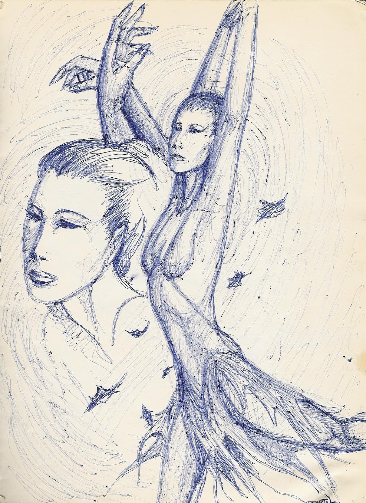


One of Nerdrum's works, entitled Dawn, looked very familiar. The grouping of figures screaming upward toward the sky reminded me of a scene from the 2000 movie The Cell, starring Jennifer Lopez, Vince Vaughan, and Vincent D'Onfrio. Sure, enough, going back to Wikipedia, I learned that Dawn was indeed the inspiration for that particular image from the movie—it seems that The Cell's director, Tarsem Singh, saw the original while visiting the house of its owner—none other than David Bowie!

Speaking of musicians, there are a couple more to add to this interesting, convoluted path of connections: The images from The Cell were also utilized in the Missy Elliott video “Get Ur Freak On”--although the Wikipedia entry for the song does not mention this, it's a bit obvious; the set for much of the video is clearly also Cell-inspired. Watch it. Ozzy Osbourne also seems to have been inspired by it, as well, here.

So, thanks to the internet and all its lovely, oh-so-clickable links, I learned about another fantastic painter and his interesting connections to various other forms of art, from movies to music videos. Inspiration bounces around all over, just like clicking on one link after another online, to lead to many new things to learn and enjoy. I hope you found out some fun stuff today, right here in this article, now another one of the many pieces of the story. If I can connect Odd Nerdrum, Jennifer Lopez, and Ozzy Osbourne, it's a small world, indeed!


For regular shenanigans, please follow my Facebook page, https://www.facebook.com/allsortsofart

Saturday, November 25, 2017

How to Create an Interesting Still Life


Whether you are just learning to draw or paint or have many years of experience under your belt, a still life is an excellent way to practice your rendering skills. Unlike working on location or from a live model, you can control the weather, keep the lighting consistent, and your subject is unlikely to fidget, want to chat, or need a potty break. But do be aware that for an interesting picture, you must have an interesting still life; you can’t just throw things on a table and call it good. Here are some suggestions to make your still life setup creative, interesting and well-balanced.

Variation. This is the main watchword for still lives; variety is the spice of life, and a still life needs spice, too! Give the viewer some different things to look at by varying the sizes, shapes, textures and colors of your setup. Imagine how a brilliant, velvety red rose would look against a fuzzy white shawl, with a shiny black glazed pitcher in the background! Make sure you use contrast to your advantage—don’t make everything light, or dark, or soft, or shiny. Mix it up and your picture will be much more lively!

Elevation. Also when setting up your still life subject, try to vary the elevations, as well—either use taller things to contrast with shorter, or use props to create different levels. For example, you could place boxes of different sizes under a drape and arrange items on the differing levels created, or you could stack smaller things on books of varying sizes.

Focal Point. While you do want a variety of objects in your picture, you should give the viewer something to home in on so that your picture draws attention in the first place. You will want to have one main subject to act as the star of the show, and once the viewer is drawn by this, the supporting players will be there to add variety and interest. The best results are usually obtained by selecting one really fascinating piece, such as a gorgeous cut-glass vase or a brightly-colored kite, then choosing a few other items that provide contrast in color, size and texture. In this picture by French painter Anne Vallayer-Coster, the ham is clearly the star of the show, but there are a lot of supporting players that add a variety of textures, colors and shapes to create interest. 


Themes. Most people think of a vase of flowers or a bowl of fruit when they think of a still life subject (or both, as seen in the picture at top, by Flemish artist Clara Peeters). These are fine, but you should also try to come up with more creative setups. Pick a theme for your still life, and then try to come up with all the things that could fit the theme. You might choose music as a theme, and you could feature a beautiful old violin as your main subject and then add in the bow, some sheet music, a metronome, a pair of opera glasses and some white gloves. You could pick food as the theme, but instead of the typical bowl of fruit, you could use vegetables instead, or even candy displayed in different dishes and scattered across a cloth. As a student, I drew a still life of the “heavy metal” theme, composed of spiked and studded leather cuffs and belts from my own rockin’ wardrobe!

Personalization. Did you know that you can actually make a portrait out of a still life setup? Instead of making a direct likeness of your sitter, use meaningful objects from their life, such as mementos, awards, and any items that reflect their personal interests or hobbies. If your client is a baseball enthusiast, for example, you could make a still life from their own collection: maybe an autographed ball or glove, a pennant from a favorite team, a pair of tickets and a game schedule, even a box of Wheaties with their hero on the front. Or instead of a theme, use many different items to represent all of their interests, like posters of favorite movies, favorite books, musical instruments, travel souvenirs and so forth. Use your imagination and get creative! This is a great way to make a special, personalized picture for someone who is shy or uncomfortable with the idea of having their portrait made.

Now that you know that still lives can be so much more than just a bunch of flowers or a bowl of fruit, go find yourself some cool African sculpture, antique beer steins or carved wooden toys and set up something that will really make an interesting picture. After all, if it ain’t creative, it ain’t art!


See my breakdown of a Vincent vanGogh's still life, here:  http://allsortsartbyali.blogspot.com/2014/11/van-goghs-stillleben-mit-gelbem.html

Make sure your still life has a strong focal point! These tips will help: http://allsortsartbyali.blogspot.com/2015/05/painting-composition-101-creating.html

At top:  Still life painting by Flemish painter Clara Peeters, from Wikimedia Commons
https://commons.wikimedia.org/wiki/File:Clara_Peeters_-_basket_of_fruit_with_a_tazza_holding_grapes_a_bouquet_of_flowers_and_a_flagon_WA1940.2.61.jpg

Still life with ham by French painter Anne Vallayer-Coster, from Wikimedia Commons
https://commons.wikimedia.org/wiki/File:Still_Life_with_a_Ham.jpg

For regular shenanigans, please follow my Facebook page, https://www.facebook.com/allsortsofart

Saturday, September 23, 2017

The Empire of Light


Above is a painting by my favorite artist, Belgian surrealist René Magritte  (1898 – 1967), called The Empire of Light. It's actually one of a series, and all the paintings have the same title, so they have to be distinguished by their locations--this one is in the Royal Museums of Fine Arts of Belgium, located in Brussels. 

The series, which attempted to show a juxtaposition of a street at night against a sunny, daylight sky, was painted in 1953-1954. One website states that the painting "became so popular that he made several versions", but I think that it's possible that Magritte painted several versions because the subject is very challenging, and he was trying to get it just right. He was attempting to show a surreal contrast between night and day, but there is a time in the evening that the sky is still pretty bright, even when the city below is cloaked in shadow, and he had to strike just the right balance to make us realize that it was, in fact, a daytime sky, and not simply a twilight one. For example, this one, at the Museum of Modern Art, could be mistaken merely for a twilight picture: 


I think of all the paintings in the Empire of Light series, the one at the Royal Museums in Brussels does the job best, probably because of Margitte's choice to include the large puddle on the street. It accurately reflects the night scene, but is unaffected by the blue sky above. This makes a stronger statement, in my opinion, of the marked difference between day and night, eliminating the possible confusion of twilight. 

If the images seem familiar to you, it might be because you own or have seen the 1974 album cover of Late for the Sky by Jackson Browne, which was inspired by the painting(s). There is actually a credit inside the album that says,"cover concept Jackson Browne if it's all reet with Magritte". Magritte was dead by then, but I guess it was "all reet" with his estate.  

By Source, Fair use, https://en.wikipedia.org/w/index.php?curid=33329375
https://en.wikipedia.org/wiki/File:The_Empire_of_Light_MOMA.jpg

For regular shenanigans, please follow my Facebook page, https://www.facebook.com/allsortsofart

Thursday, June 1, 2017

From the Sketchbook - "Eroche"


This drawing was a concept sketch for a painting entitled "Eroche" (pronounced arrow-key). The name doesn't really refer to anything; it just came to me from nowhere and I liked the sound of it (seems vaguely Greek, like Eros). Since it was just a sketch and not a finished piece of art, ball-point pen was the weapon of choice, although to be honest, I actually have produced finished art in ballpoint (mea culpa).

The composition in this sketch seems to be for a montage, but I really was just adding individual studies for the hands and face. I didn't envision more than just the single figure in the picture, but since her hands didn't make it onto the page in the larger version, I wanted to work them out in detail. The position of the hands is about right, but I have no idea why I made the fingernails so long, and I would definitely change that in the final piece, should I ever get around to producing it.

This was drawn from an artistic "vision" that I had--not a mystical type of vision, just a creative picture in my head that was pretty fully realized, of a dancer in an arabesque posture, amid a swirling of fallen leaves. Her skirt has a fluttering hem that mirrors the edges of the leaves.

Where did the flying leaves come from? I was actually inspired by this video for the song "Whisper To A Scream (Birds Fly)" by the 80s band Icicle Works https://www.youtube.com/watch?v=NVQCpI4GbKQ . That video is predominantly brown in tone. I would like to make the painting monochromatic, as well, but I think it has more of a blue feel to it. I do love the imagery and movement of the flying leaves, but I wouldn't use as many as they did in the video--the torrent of leaves seems very chaotic, and I am trying to achieve more of a lilting feel.

Image is of my own artwork. All rights reserved.

For regular shenanigans, please follow my Facebook page, https://www.facebook.com/allsortsofart

Friday, March 31, 2017

Wonder Woman vs The Rockets - Original Comic Art


When I was six years old, the first comic book I read was Wonder Woman, and she's been my hero ever since. Beautiful, intelligent, and strong, she represented all the physical, intellectual, and moral ideals one could achieve, and it didn't hurt that with her long dark hair and blue eyes, I had a role model that actually looked like me, as opposed to all those blonde princessy types who supposedly epitomized loveliness (yeah, I know about Snow White, but she was waiting to be rescued, and Princess Diana did her own rescuing, thankyaverymuch). When you have a pretty blonde sister, you latch on straightaway! I imagine the little red-haired girls adored Batgirl in much the same vein.

Being of an artistic nature, I drew a lot, and one of my favorite subjects was Wonder Woman. Here I have used pen and ink and art markers on bristol board to depict her in a race against time, readying her unbreakable golden lasso to try to rope some hostile ordnance that has been launched against innocent targets. She has super-speed and strength, but it seems her work is cut out for her. Will she stop the malicious missiles in time? Well, of course--she's Wonder Woman!

More of my comic art:
http://allsortsartbyali.blogspot.com/2016/04/original-comic-art-silver-age-wonder.html
http://allsortsartbyali.blogspot.com/2015/05/superman-batman-superbat.html
http://allsortsartbyali.blogspot.com/2015/03/batgirl-wonder-woman-wonder-bat.html
http://allsortsartbyali.blogspot.com/2014/12/a-portrait-of-cheetah-wonder-womans.html

The character of Wonder Woman is (c) DC Comics, Inc. 


For regular shenanigans, please follow my Facebook page, https://www.facebook.com/allsortsofart